
3 Common Web Accessibility Mistakes Therapists Make — and how to avoid them
As a web designer for therapists, I know how deeply you care about creating spaces where people feel safe, included, and understood. Your website is an extension of that space, and is often the very first point of connection with a new client. But if your site isn’t accessible, it can unintentionally shut out the very people seeking of your support.
Web Accessibility isn’t just about checklists or compliance. It’s about inclusion. It’s about making sure people who already face barriers in daily life don’t encounter even more when they’re reaching out for support. The truth is, most therapists (and even web designers— myself included!) were never taught about web accessibility. The mistakes I see usually stem from design norms that center the able-bodied experience. The good news is, once we know better, we can do better. And the fixes are often simpler than you’d think.
Here are three of the most common accessibility pitfalls I see on therapist websites — and what you can do instead.
1. Creating Images with Text
It’s tempting to design something pretty in Canva — maybe a styled quote, a text heading over a background image, or even your practice name — and then upload it to your website as an image. The problem? Screen readers can’t read text that’s part of an image, so it becomes inaccessible to clients who rely on them.
This is especially important with headings. Screen reader users often navigate a page by moving from heading to heading, the way sighted users might skim. If your headings are part of an image, that crucial roadmap is lost.
How to fix it: Whenever possible, use real, selectable text on your site rather than uploading images that contain text. If you do use an image with text, make sure you also provide that text in a way screen readers can access — either directly on the page or by adding meaningful alt text.
2. Relying on Color Alone to Convey Meaning
Maybe your links are a nice shade of blue, but aren’t underlined. Or maybe incomplete form fields are outlined in red. These are common, but ableist, design standards that use color as the only way to convey important information.
But color alone doesn’t communicate meaning to everyone. People with color vision differences (and there are a lot of them) may not see what you’re trying to highlight.
This isn’t just about color blindness. Many people with low vision — or even anyone using their device in bright sunlight — can struggle to distinguish subtle color differences. Without another cue, essential information can easily get lost.
How to fix it: Use more than color. For links, add an underline. For form fields, include an asterisk or label like “required.” The goal is to build in multiple ways of signaling meaning so that people with diverse access needs can all use and enjoy your website.
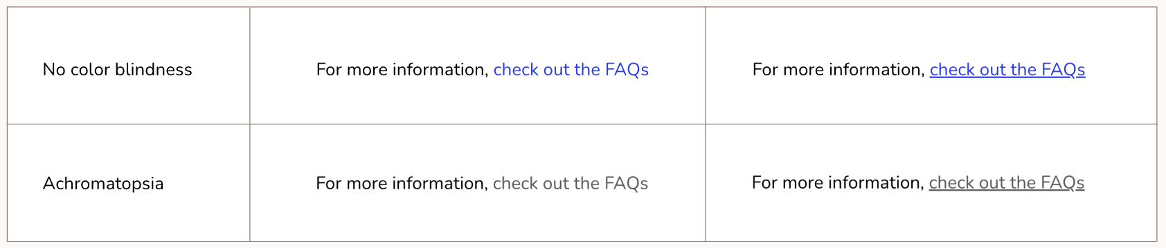
Although it’s a common design norm, relying on color alone to show hyperlinks can make them difficult, or even impossible, to distinguish for people with certain types of color blindness. That’s why it’s it’s important to always underline links, or provide another secondary visual cue.
3. Text Overlays on Images
A popular design trend is to place text directly on top of an image, like a quote over a photo, or a headline across a banner image. While it can look appealing, it often creates accessibility barriers. If the image is too busy or the text doesn’t have enough contrast with the background, the words can be very difficult to read.
When text blends into an image, people with low vision, limited color vision, or anyone using a screen in bright light may struggle to read it. Even fully sighted users can find it tiring, which means they may skip over your message altogether.
How to fix it: Ensure strong contrast between your text and background. A simple solution is to add a semi-transparent overlay behind the text, blur the background image, or place the text in a section of the image that has clear contrast. Clear, readable text helps everyone — and it still looks professional and inviting.

When the background is too busy or low-contrast, text becomes hard to read. If I wanted to keep this photo, I’d add a black semi-transparent overlay to make the text stand out more clearly.
I’ll be honest: I’ve made every one of these mistakes.
Not because I don’t care about accessibility, but because design culture so often prioritizes aesthetics over inclusion. Part of my mission as a web designer for therapists is to help shift that culture.
Accessible design isn’t just about meeting the needs of people with disabilities — it’s simply good design. Clear, well-structured websites are easier for everyone to use, and as a bonus, they also tend to perform better with search engines.
And if you’re like me (maybe a bit of a perfectionist…) you might feel overwhelmed by accessibility at first, especially if your site is already built and you don’t have time to make widespread changes. But it doesn’t have to be all-or-nothing. Each small adjustment makes it easier for people to connect with your work. Every improvement opens the door a little wider for someone who needs your support.
Looking for ways to make your site more inclusive?
I offer a free audit to spot accessibility gaps, and web accessibility package to help you close them.

Maggie Goulder | custom web designer for therapists
Maggie Goulder is a web designer specializing in websites for mental health professionals. As a Social Work graduate and a former User-Experience designer, her unique blend of clinical experience and web design expertise allows her to support therapists in bringing their practices online in a way that is authentic, ethical, and naturally attracts the right clients.